
BLASTO'S CEREAL
Personal
For anyone who knows me well, they know I love cereal. In the morning, at night...really anytime.
I also love vintage cereal box design. There was something really pure and fun about the cereal box designs of the 60s, 70s and even 80s. The boxes always featured bright, flat colours and bold lettering. I decided to design a fictional brand of cereal that would fit right into that era.

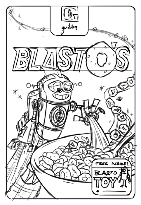
The box design also needed a logo for the fictional cereal company (called "Gulder Cereals"). The idea was to give it a retro feel, akin to a logo for General Mills or Quaker Oats from the 60's or 70's. I started with a bunch of sketches and honed in on a large "G" framing a graphic representation of wheat. The logo passes the test of working well at a small size and in one solid colour, which it would need to on the cereal box.

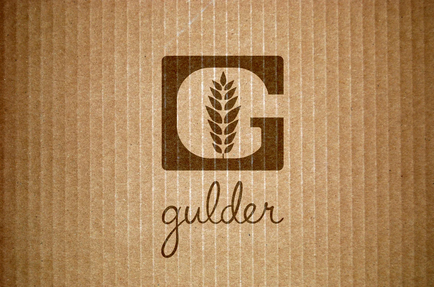
Final Logo
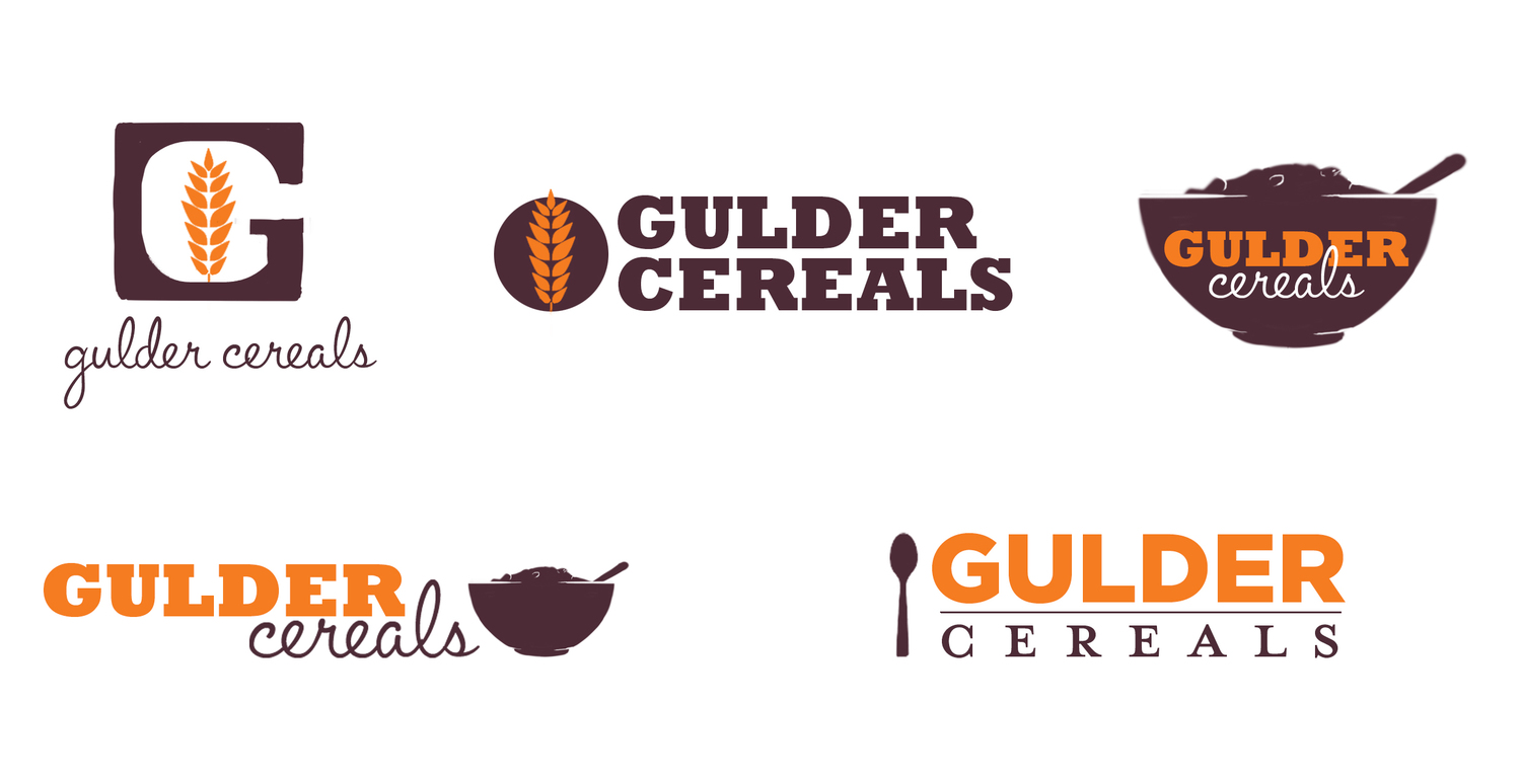
Rough Sketches